In case you still need to set these tools up for yourself, or want to edit and redesign your previous set-up, make sure you read our guides on how to do that as easy and successfully as possible:
How to set up & edit the Trigger Button
How to set up & edit the WonderBar
How to set up & edit the Exit Intent/Pop Up
How to Find Your Data
To access the report, navigate to the Marketing dashboard in your left-hand menu and select the Engage Tools tab.
Why This Data Matters
Any sales strategy needs to be evaluated and adapted. This report allows you to move beyond raw numbers to understand:
Revenue Contribution: See exactly how much each tool adds to your bottom line.
Tool Comparison: Discover which tools are your "heavy lifters" and which need a design or copy refresh.
Device Behavior: Understand if your mobile visitors interact differently than desktop users to optimize your mobile-first strategy.
Understanding the Metrics
This is helpful technical detail. I have refined the "Understanding the Metrics" section to be more precise based on the engineer's definitions of how we track Cookies vs. Sessions vs. Views.
Understanding the Metrics
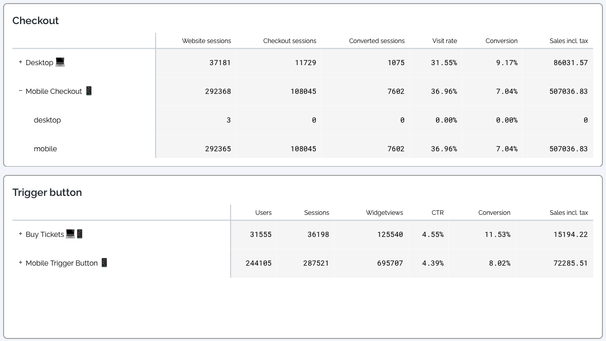
The report is divided into sections for your Checkout performance and your individual Engage Tools (Trigger Button, WonderBar, Pop-up).
1. Checkout Table
This section tracks the overall conversion funnel of your website:
Website sessions: Total unique sessions on your site.
Checkout sessions: Sessions where a user actively interacted with the checkout.
Converted sessions: Sessions that resulted in a successful payment.
Visit rate: The percentage of website visitors who entered the checkout.
Conversion: The percentage of checkout sessions that resulted in a sale.
Sales incl. tax: The total revenue generated through that specific configuration.
2. Engage Tools Tables (Trigger Button, etc.)
These metrics specifically measure how your engagement tools are performing:
Users: The number of unique cookies exposed to the tool during their visit. This represents individual visitors.
Sessions: The number of unique sessions in which the tool was displayed to a visitor.
Widgetviews: The total number of times the tool was displayed. (Example: If one visitor sees the Trigger Button on 3 different pages during one session, it counts as 1 User, 1 Session, and 3 Widgetviews).
CTR (Click-Through-Rate): The percentage of views that resulted in a click (Unique Clicks / Widgetviews).
Conversion: The percentage of users who made a purchase after interacting with this specific tool.
Sales incl. tax: Total revenue attributed to the tool (using the last-click attribution model).
Important Technical Details
To help you interpret your data accurately, please keep the following updates in mind:
Local Time Reporting: The new report is based on local time (your venue's timezone), whereas the legacy report used UTC. This provides a more realistic view of daily peaks but may result in slight differences if comparing to historical data.
Unspecified Configuration: You may see a row labeled "Unspecified Configuration." These represent valid sessions where specific configuration data wasn't captured. We include these to ensure your total session and conversion counts remain 100% accurate.
Device Type Accuracy: Device type is determined by the user's screen size at the moment the event is triggered.
Note: You may occasionally see a "Desktop" device type listed under a "Mobile" configuration if a desktop user has a very small browser window. This is expected behavior based on real-time data capture.
Pro-Tips: Turning Insights into Action
1. Quality vs. Quantity You might find that your WonderBar has fewer views but a much higher Conversion Rate than your Trigger Button. This suggests that visitors engaging with the WonderBar are "highly qualified"—meaning they are already deep in the consideration phase. Consider making your WonderBar appear sooner to capture that intent earlier.
2. Mobile Optimization If your Mobile conversion rate is higher than Desktop, your audience prefers booking on the go. Use this insight to simplify your mobile design even further or consider adding a "Call to Action" that is even easier to tap.
3. Test and Adapt Notice a drop in CTR for your Pop-up? Try changing the colors or the discount offer. Because the report updates efficiently, you can monitor the impact of these changes in near real-time.