As you most likely know, the Trigger Button is a vital part of your Convious platform. It will appear in the bottom-left corner of your website with an engaging and customized text. Once your website visitor clicks, the trigger button opens your Convious ticket shop and allows you to sell more tickets online at better prices.
It is clear that you want your Trigger Button to be as engaging as possible while also integrating perfectly with your website design! Luckily, you will be able to be in charge and this will be the case at all times.
To make sure your engage tools are always in perfect shape for your visitors - you can set up multiple engage tools for different audiences and devices.
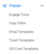
How to navigate on your engage tools page
1. Navigate to the main menu on the left-hand side of your screen and click Engage Tools within the Engage section.
Now, you will see all your previously set up engage tools separated by tabs.
To view your setup Trigger Buttons, choose the Trigger Button tab.
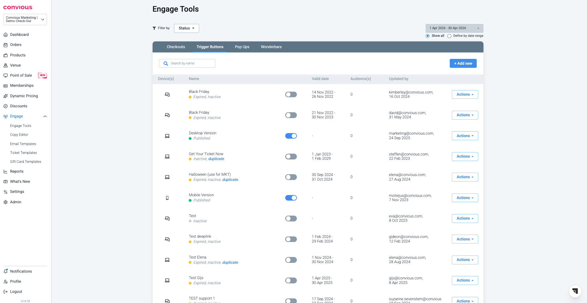
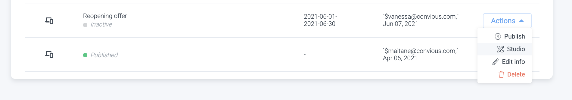
In each overview, you can:
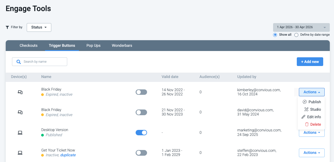
Unpublish or publish an Engage tool version
Edit its information: Name and device - but you cannot change its type.
Studio: edit its text, style, triggering, or settings
Delete a version
via the Actions option on its right-hand side.
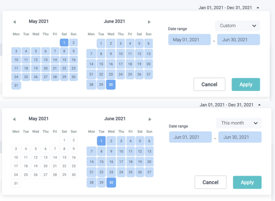
2. Per engage tool, you can filter your previously set-up versions by date range or status.
2 a) If you want to filter them by date range, you have to choose to Define by date range.
Then you can choose either a custom date range within the calendar or select a pre-defined range.
b) If you want to filter by Status, select Status at the filter menu on the left and select one more status you want to view.
You can filter and view published versions, unpublished versions, drafts, upcoming (scheduled) versions and expired (previously published) versions.
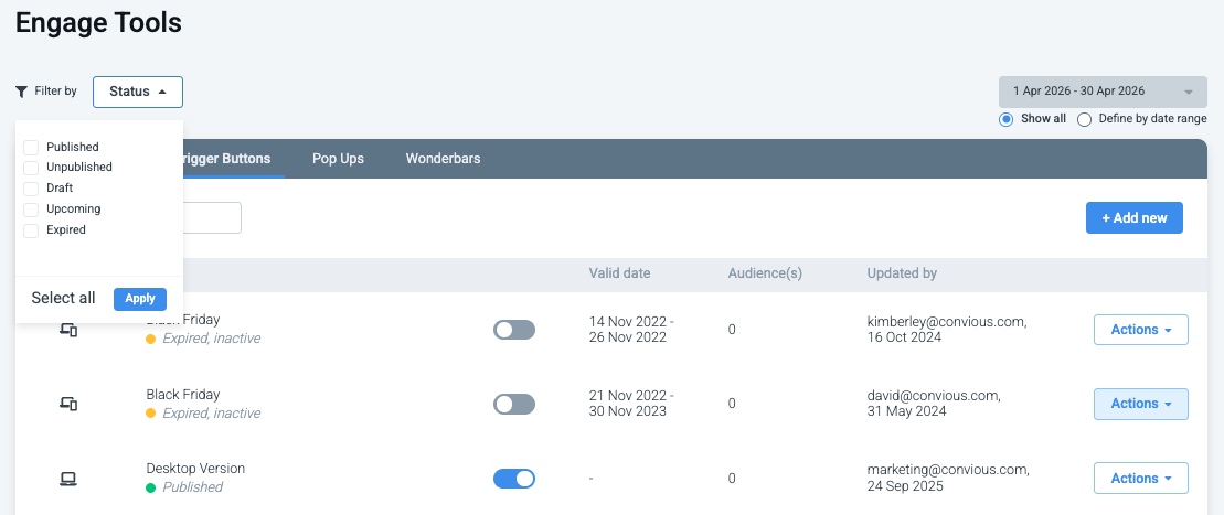
Make sure to select the right status and hit apply.
How to create a new Trigger Button
1. Click +Add new, If you don't have it set up yet.
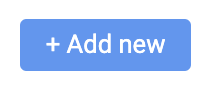
2. Give it a name.
The tool type will be set depending on the engage tool tab you are on.
3. Set up the device you want to trigger this on.
All (default version): This is displayed on desktop as well as mobile and when desktop/mobile versions are not defined.
Desktop: These are desktop or laptop devices with screens larger than 7" in diagonal.
Mobile: These are hand-held devices that include a phone.
4. Schedule your version by setting a start and end date.
5. Click Save.
Do you have questions about scheduling different versions that haven't been answered? Head over to the Convious Engage tools - FAQ.
To edit the Pop up, click on Action and then Studio to enter the Convious Studio.
Trigger Button text
The first step within the studio will be setting the language settings, defining text, and linking it.
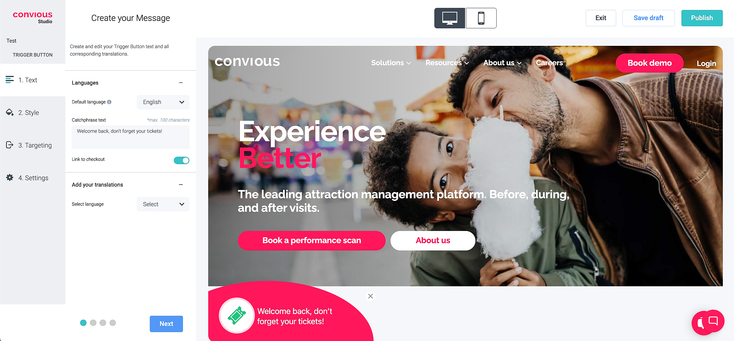
1. The first step is deciding in which language you will set up your Trigger Button and, subsequently, your Checkout.
We strongly recommend two things:
Set up your Trigger Button as well as Checkout in the same languages as you have your website, and
always have both connected to provide a seamless user experience.
There is nothing more disappointing for a native speaker to enter your page, find the Trigger Button in their mother tongue but then not be able to purchase tickets in the same language, although it appeared as such first.
2. Once you have chosen your Language, for example, English and German, you need to decide your default language. This is supposed to be your website's main language.
3. Now, it is time to put in an engaging text! Here you can be creative, but we advise you to be clear to successfully guide your website visitors towards your Checkout.
When you enter your text, you will immediately be able to see how it will appear on the Trigger Button.
4. Then you need to make sure your Trigger Button is linked to your Checkout by clicking on the toggle Link to checkout.
If you use the Trigger Button for different purposes, which we do not advise you to do, you can also link it to an alternative URL that will function as the destination page your users will be sent to after clicking the button.
5. Next up is creating the translations for the additional languages you chose before.
You enter your text and done!
6. Hit Next to move on the next step of setting up your Trigger Button.
Trigger Button style
Now it is time to decide the look and feel of your Trigger Button.
It should be in your interest that your Trigger Button, on the one hand, blends in with your website's design, but at the same time, and this is very important: that it stands out!
If your Trigger Button stands out, your website visitors' attention will be grabbed more easily, and they are more likely to click, leading, subsequently, to more sales!

1. First, you will decide on some general features: Font-Family, Text size, Font color, Background color, and Background opacity.
Again, all changes will immediately be visible in your Studio so you can see what it will look like and make great decisions.
2. Next, you will need to choose and design the icon shown within the Trigger Button.
We provide you with a pre-set bundle of a Ticket icon, but you can upload different icons if you want to customize your Trigger Button even further. To do so, you can either browse through your computer files or drag and drop your image.
Choose your SVG icon color as well as your preferred Background color.
To set color, you can either enter a HEX code, RGB codes or use the cursor to find the color of your choice.
3. Lastly, you can choose to give your user the option to be able to minimize or hide your Trigger button. When enabled, the user can close the Trigger Button by clicking on the 'x' icon
You can enable these features by clicking on the toggle Enable minimizing.
Furthermore, you can decide the Icon size and Type.
4. Hit Next and you are done with styling your Trigger Button.
Trigger Button targeting
The third step is setting the targeting rules to define which pages your Trigger Button will be shown on.
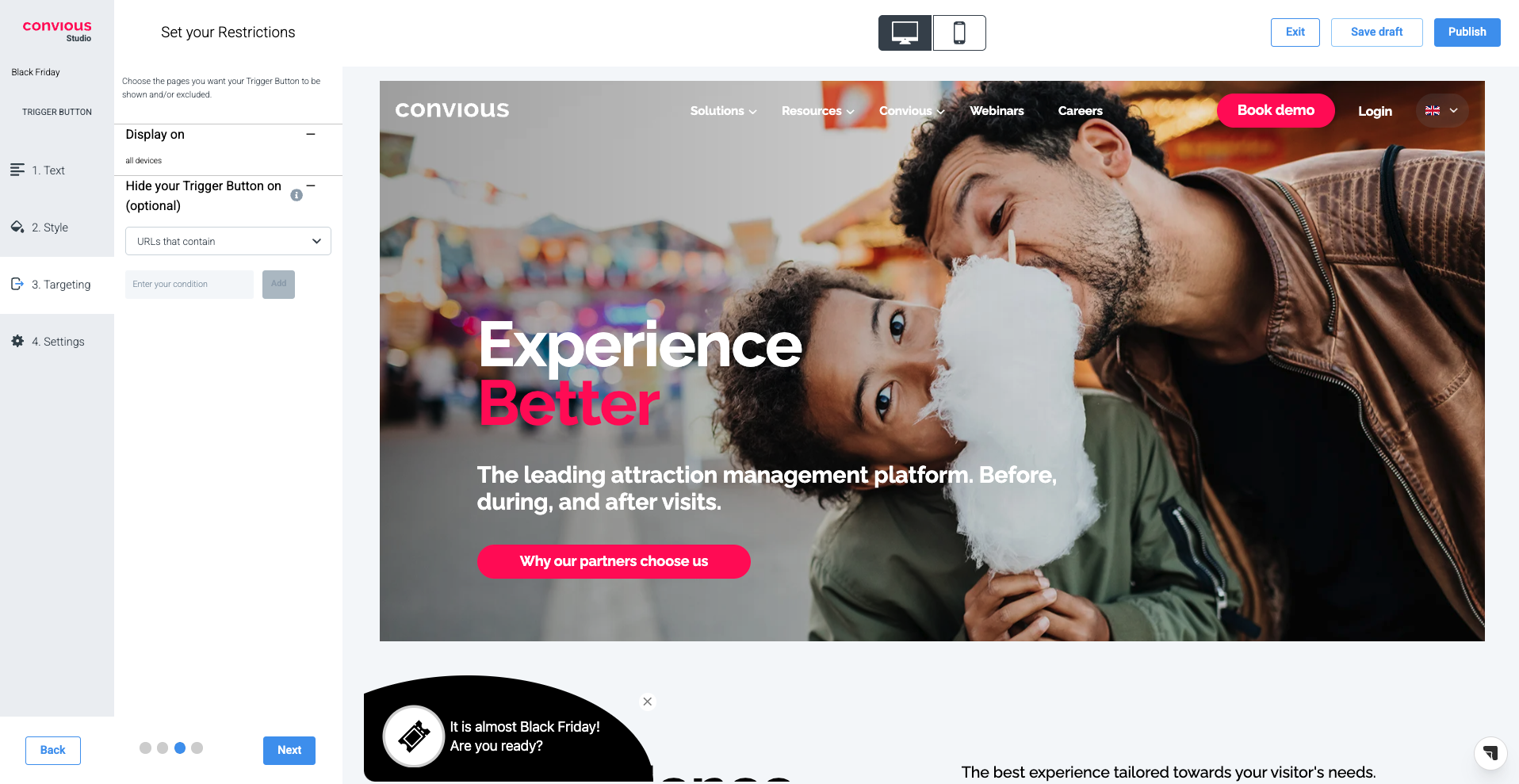
1. Display on will be pre-set to All Devices as you have chosen to design the Default Version.
2. Secondly, you have the chance to hide your Trigger Button on certain pages in case you would like to do so. If you expand the section with a click, you can choose between URLs that contain, URLs that do not contain, and REGEX.
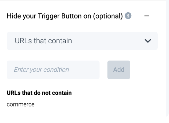
If you choose URLs that contain, you can add any phrase included in a page URL on which you do not want the Trigger Button to be shown.
If you want, for example, to hide it from your Impressum, you add /impressum to the field and click Add to save.
Then the Trigger Button will not be shown on any URL that contains /impressum
The same works on the contrary if you choose URLS that do not contain.
This might be useful for a multi-location venue. For example, on Amsterdam website page you would like to have a trigger button leading to the Amsterdam product list while on the Paris website page --> Paris product list.
REGEX is short for regular expression, and can be defined as 'a string of text that allows you to create patterns that help match, locate, and manage text.' This is, in most cases, only relevant for developers. We recommend using URLs that contain or URLs that do not contain to make it easy.
Generally, we recommend not to hide your Trigger Button or any of your engagement tools from your pages.
As you can see, we have specified our triggering in extreme detail by adding a series of specific URLs.
3. Hit Next to finalize your Trigger Button.
Trigger Button settings
In the last step, you will be able to set further visibility rules that define the Trigger Button's timing to your audience.
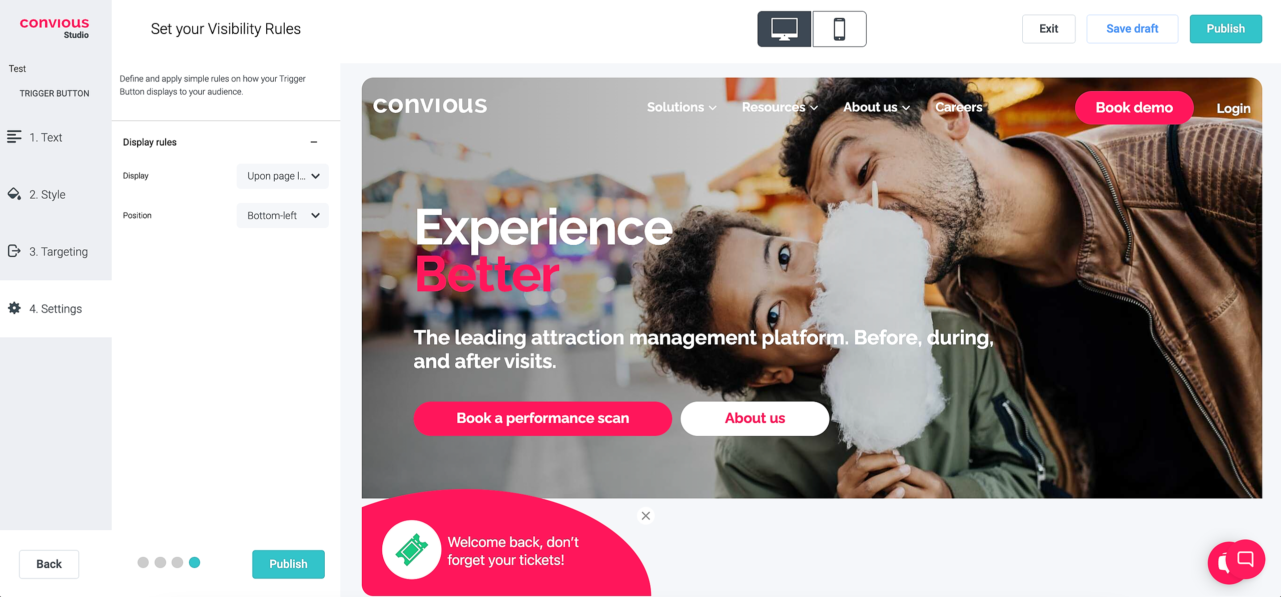
1. First, you need to decide on Display
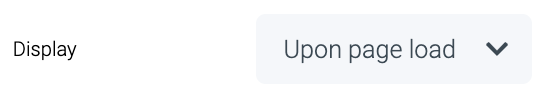
You have the option to show the Trigger Button Upon Page Load, which is highly recommended as it grabs the website visitors' immediate attention.
But you can also choose to set it up so that it will show With Delay of your choice.
Upon the moment, your website visitor tries to exit your site.
The moment your visitor reaches 50% completion of scrolling through your page.
Lastly, once your website visitors scroll up your page - require them to first scroll down.
2. Next, you are able to decide on the position of your Trigger Button. All 4 corners of your screen are possible. However, we strongly advise you to keep it on the bottom-left.
When designing our product, we did extensive research on the optimal position, and the bottom-left was a clear winner and was thus, set as the default option.
🎉 Hit Publish to either schedule to go live, go live instantly or select Save draft to come back to editing later!