Navigate to & within your pricing report
1. Navigate to your main menu on the left-hand side.
2. Click on Reports.
3. Within the Reports, choose Sales & finance and browse to the tab 'Pricing'
Let's dive into what you see here
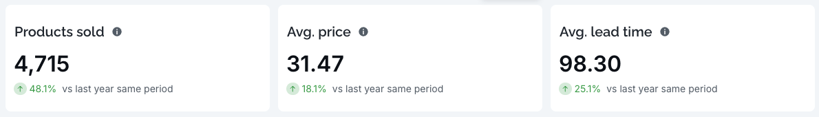
Key KPIs
At the top of the report, you’ll find high-level metrics for your selected period, including:
Total products sold
Average price
Lead-time behaviour (how far in advance customers book)
Year-over-year comparisons
These KPIs help you evaluate performance at a glance.
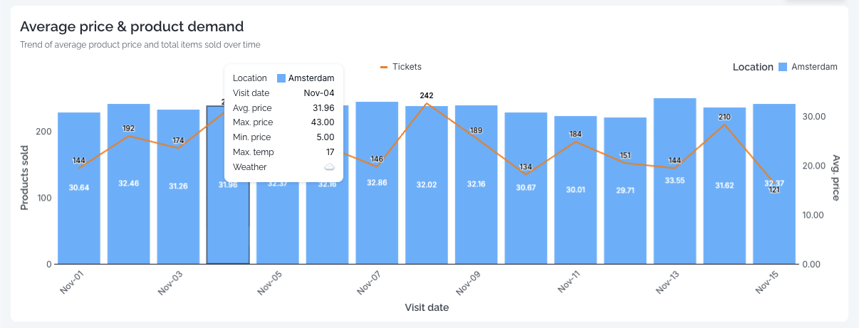
Sales & Pricing Over Time
The main chart visualises:
Sales (incl. tax)
Actual and expected demand
Minimum, maximum, and average prices
Weather indicators (where applicable)
You can hover over any point to view detailed breakdowns.
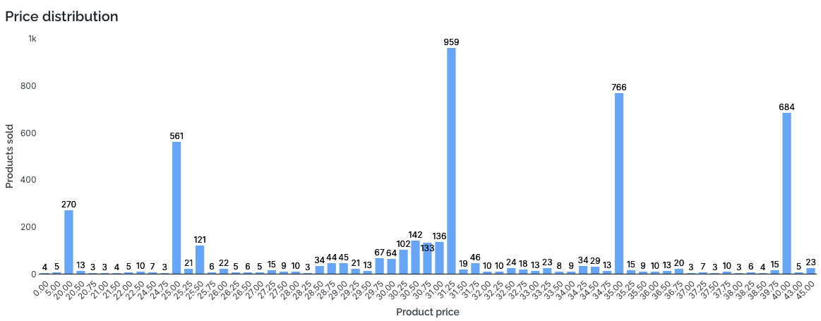
Price Distribution
This section shows the distribution of actual prices sold, so you can understand:
How often products sold at minimum or maximum price
How dynamic pricing behaved during the selected period
Which price points perform best
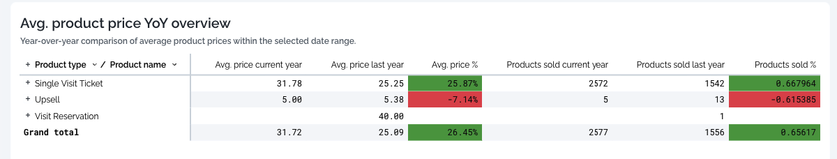
Average Product Price – Year-over-Year Overview
This chart compares the average product price in your selected date range with the same period last year.
It helps you quickly spot trends such as:
Price increases or decreases over time
Changes in visitor willingness-to-pay
The impact of pricing strategy adjustments
This visual makes it easy to evaluate long-term pricing effectiveness.
Temperature vs. Average Product Price
This chart shows how temperature on each day correlates with the average product price sold.
It helps you understand:
How weather conditions influence your pricing behaviour
Whether warmer or colder days drive higher demand (and therefore higher average prices)
How to plan future pricing during specific weather patterns
This is especially valuable for outdoor venues where weather has a strong impact on attendance and revenue.
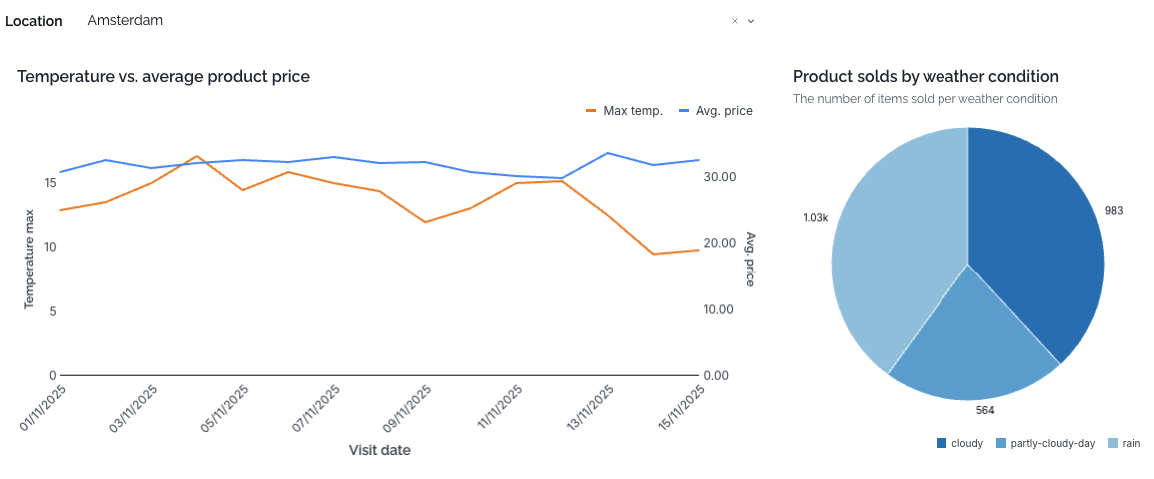
Products Sold by Weather Condition
This chart displays the number of items sold per weather condition, such as:
Sunny
Cloudy
Rainy
Snowy
Windy
It helps you assess:
How weather affects visitor turnout
Which conditions drive the highest or lowest sales
Whether operational decisions (e.g., promotions, staffing, pricing) should be adapted to weather forecasts
Together, these weather-driven insights give a deeper understanding of demand behaviour — enabling better planning, forecasting, and pricing decisions.