What is a Checkout funnel?
Your Checkout funnel is the path you expect your website visitors to follow after entering the Checkout up to the final purchase.
Why is your Checkout funnel report important?

As you can take from the definition, your Checkout isn't just a sales channel in which guaranteeing a smooth buyer journey is crucial; it also is a vehicle of communication - your chance and obligation to communicate the information needed to have a pleasing and informed experience.
To make this even clearer: If your website visitor wants to buy a season pass and you have 3 different types - it is crucial for your visitors to understand the differences and to find the one relevant to them.
This is why we keep reminding you to use tools like the copy editor, and the engage tools campaigns to update and optimise your Checkout.
To take that to the next level, we now bring you your Checkout funnel report.
Your Checkout funnel report will allow you to understand how your website visitors go through your funnel before buying or leaving. You can compare ticket flows and see conversion trends.
In a nutshell: This report helps to see how your Checkout is performing and pinpoint optimization opportunities. All according to a proper data-informed process.
How to use the report
Let's dive into the sections of your report one by one.
This section will be about understanding how to read the charts as well as turning them into actionable insights. We will give examples of how each part of the report can lead to learning about the buyers' navigation behaviour and resulting actionable insight for optimization.
And while we talk a lot about optimization - you may also just find out what you are already doing really well by implementing loads of our best practices!
Numbers at first sight
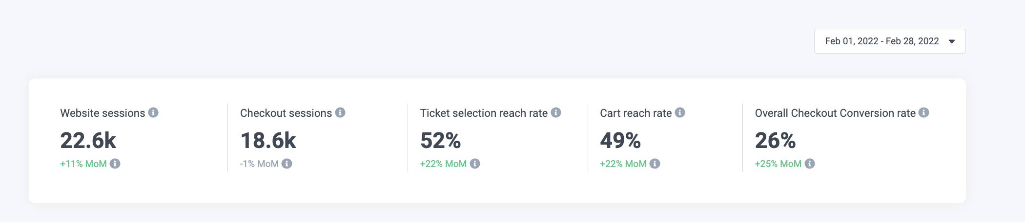
In the first part of your report, you can see the following numbers:
Website sessions: Just as within the other reports, one session includes the collection of interactions a single user takes within a 30 minute time frame on your website. This means all actions a user takes on your website within 30-minutes equals one session. Please note that this also includes bounced sessions and visits to any page on your domain, including pages where your Checkout may be hidden.
Checkout sessions: The number of sessions in which users, among other actions, entered your Checkout. Remember, a session is the collection of interactions a single user takes within a 30-minute time frame.
Ticket selection reach rate: This is the rate of Checkout visitors who reached any ticket selection page within your Checkout. A ticket selection page is a page where products are listed. →
Cart reach rate: The rate of Checkout visitors who reached the cart page within your Checkout. This means they have selected products and dates and time slots (for dated products) and then went on the cart review or overview page. →
Overall Checkout conversion rate: The overall conversion rate includes all new purchase conversions and reservation conversions generated from visitors entering Checkout to finalising the purchase or reservation.
All of the above will be shown to you in regard to the timeframe you have selected in the upper right corner.
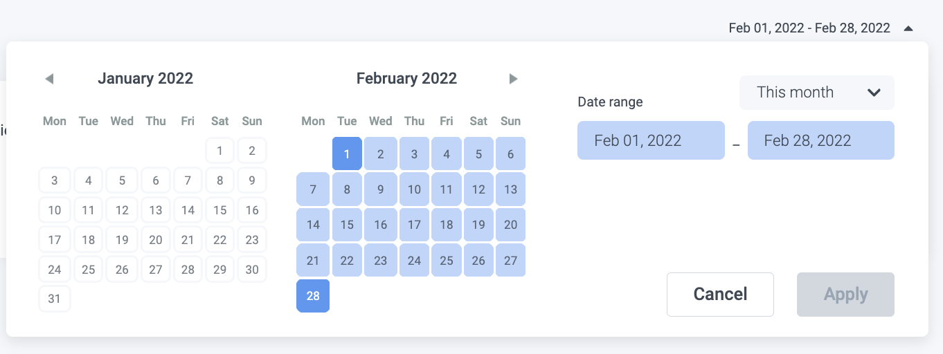
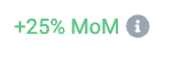
The comparison below the given numbers, as shown in the example on the left, shows the growth or decline to a comparable timeframe (Thus, Month on Month as we selected the entire month of February.)
Checkout funnel chart
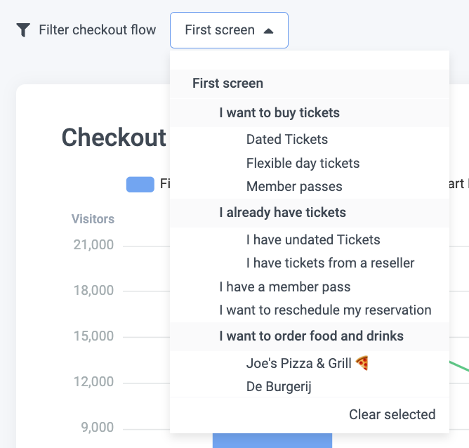
First: You need to understand you can filter by Checkout pages.
By default, the first screen of your Checkout will be selected, but as you can see in the tree menu, you can choose any flow or page.
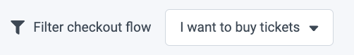
To explain how to understand the chart, let's select the 'I want to buy tickets' flow.
The filter will apply to the first two charts.
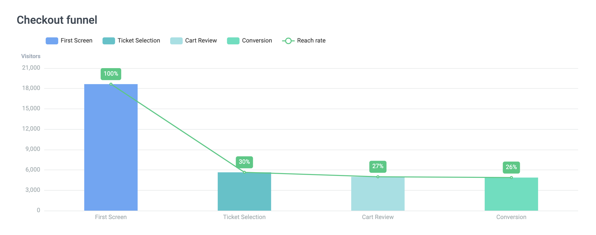
Here you see that 100% of your Checkout visitors of this flow have seen the first screen/page, and of those, a total of 30% went onto the ticket selection page. This means the percentage you see in the green label is the percentage of people who reached the step out of all visitors entering the flow (also called the reach rate). The green laben is not the number of people who dropped off between the steps.
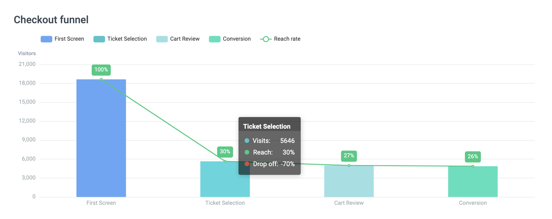
If you want to see the drop-off from before until this page, hover over the bar.
Upon hovering, you can also see the rate and the total number of visits.
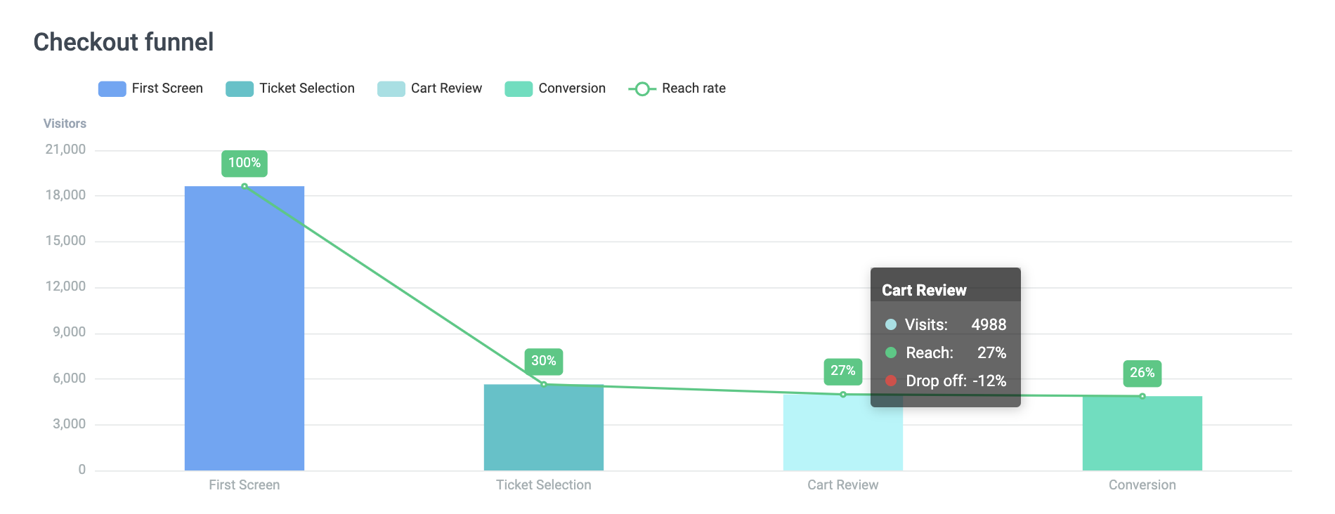
Further, we can see that the next step, the cart review page, was reached by a total of 27% out of all people who entered the flow.
Remember: The drop-off rate is calculated based on the step before and the reach rate is the number of people who reached the screen out of all people who entered the flow.
So, for the Cart Review page, this means 12% of those who reached the ticket selection page dropped off and did not reach the cart review page.
Lastly, we want to know how many people did actually convert.
Let's quickly recap the definition of conversion:
A conversion has taken place if a user completes a desired action.
What the desired action is can vary. For the Checkout, we have defined two:
1. When a new purchase is placed successfully.
2. When a reservation is placed successfully.
In the case of the 'I want to buy tickets' flow, the desired action would be placing a purchase.
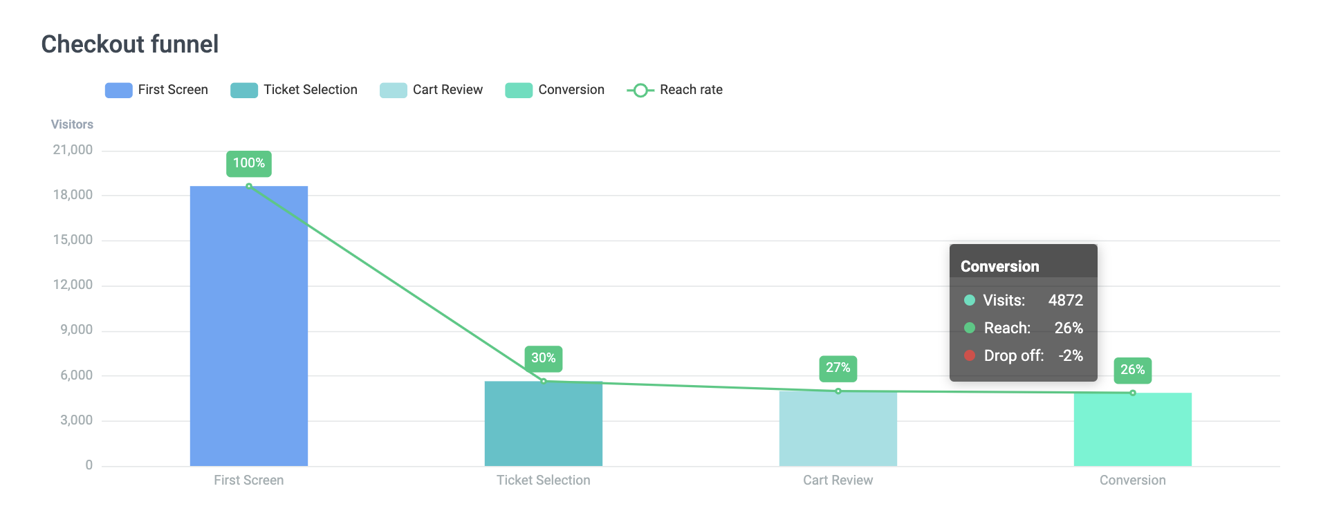
Here we see a total of 26% of all people who entered the flow converted (4872 people). And only 2% of visitors who reviewed their cart dropped off and did not convert.
Good to know:
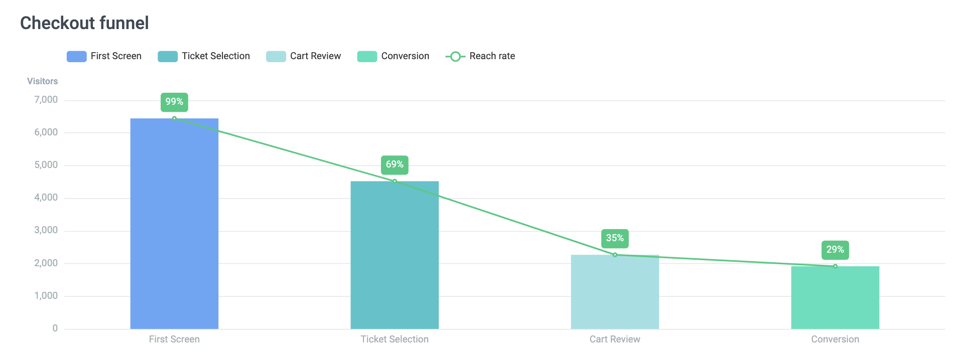
Suppose you choose a flow and see the first screen shows less than 100% reach rate like in the example below. In that case, this often is caused by direct deep links that are shared and connected to communications such as email campaigns or push messages.
Questions & examples to discover (actionable) insights
Is there a big drop-off rate between steps, or does your reach rate decline dramatically?
Then something may be unclear or the value of the product(s) within the next step not highlighted enough. Maybe it is time to review your descriptions, titles and images. You should also check functional changes you can make, like removing unnecessary steps.
Is there a huge drop-off rate between cart review and payment?
Maybe your visitors' are more price-sensitive than expected, and once they see their total, they need more time to think about their purchase. What could you do to help them make a choice?
Is there a big difference in reach between flows such as dated and undated tickets?
This may tell you about the level of certainty and planning your visitors like. Or it is related to the order your flows are presented. Try to learn more about it by testing and asking (maybe in a survey!).
In a nutshell: Any significant change or surprise tells you something about the page it concerns. It is thus important for you to investigate these pages and think about how to improve them with small tweaks.
Checkout steps and conversion during time
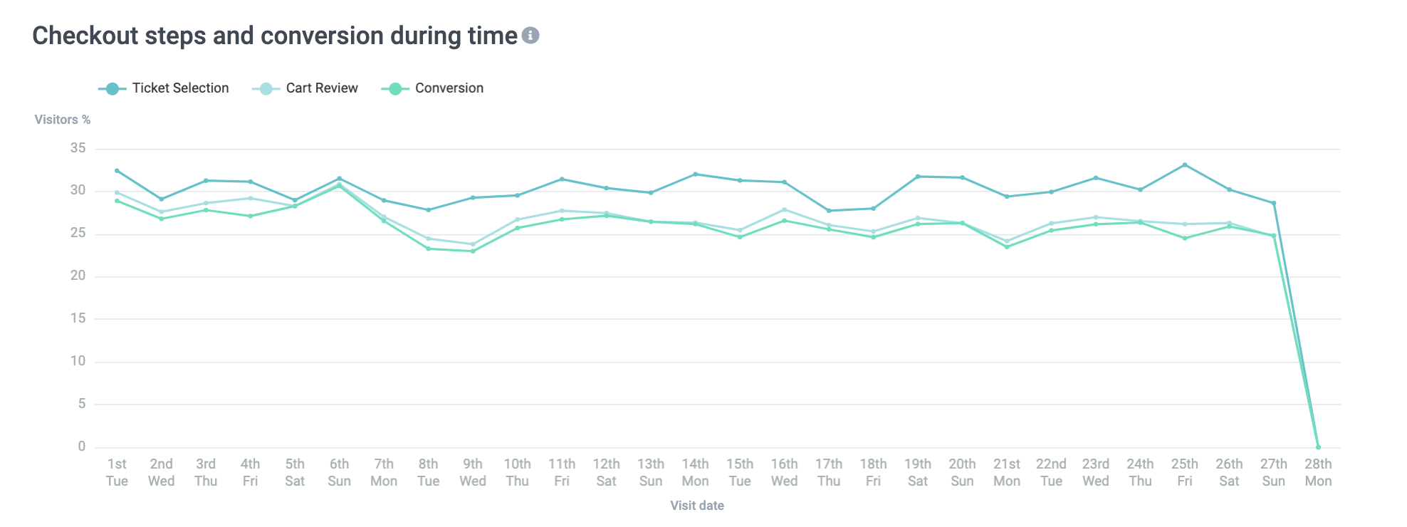
Here you see the reach of the ticket selection and the cart review over a span of time. This helps you identify unusual spikes or dips as well as reoccurring patterns.
The filter you selected above will apply here.
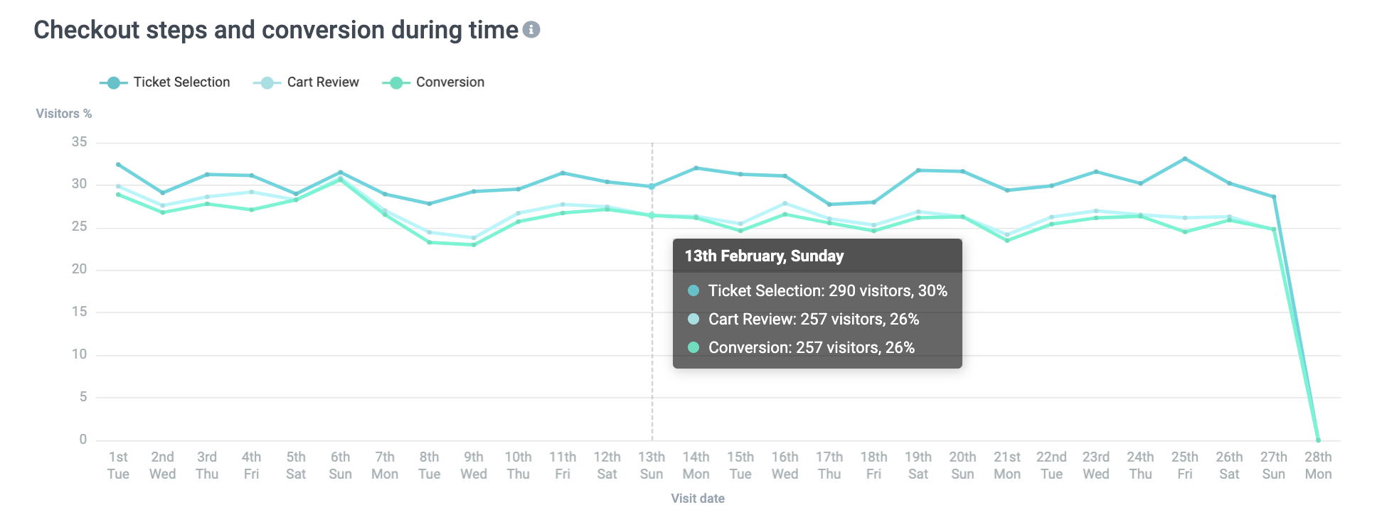
If you hover over the chart, you can see the exact reach rate and conversion rate. Please use the legend to understand which is which.
Questions & examples to discover (actionable) insights
In the example above, we can see that on Sunday, February 13th, everyone who reached the cart review screen ended up buying.
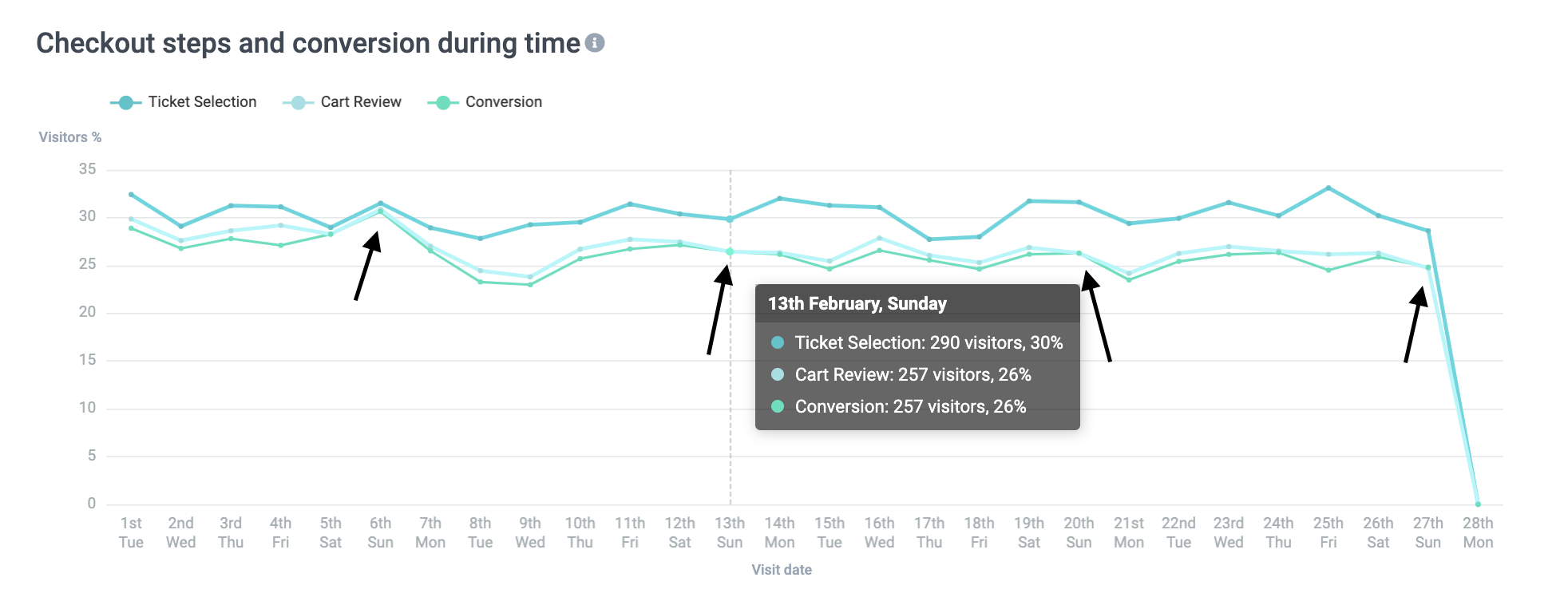
And when looking closer, we see that this seems to happen every Sunday. Whereas the rest of the week, there always is a small difference between the cart review reach rate and the conversion rate. Finding such patterns is crucial to understanding seasonality and purchase intention.
While the above example is rarely the case, finding even the smallest patterns or breaks in patterns is essential. Even if your cart review and conversion rate do not meet but stay fairly stable in relation to one another, this is important to note, especially if something out of the ordinary happens.
On the contrary to the first example, you may notice big differences on certain days (see above on Sunday, 6th). Think about what that day (day of the week or the date itself) may mean to understand better.
Do you see traffic suddenly rising for some time but not cart reviews or conversion? Review your descriptions, titles and images. Is everything clear and up to date to latest regulations? Are you sharing with them the most relevant content?
Pages with highest exit rates
The exit rate of a specific page is the rate of Checkout visitors who exit your Checkout on or after seeing that page. This translates to the fact that the higher the exit rate, the more people leave the funnel at that point of their journey.
Please note that here the flow or page filter does not apply anymore. This graph will show you the top 5 pages of all flows.
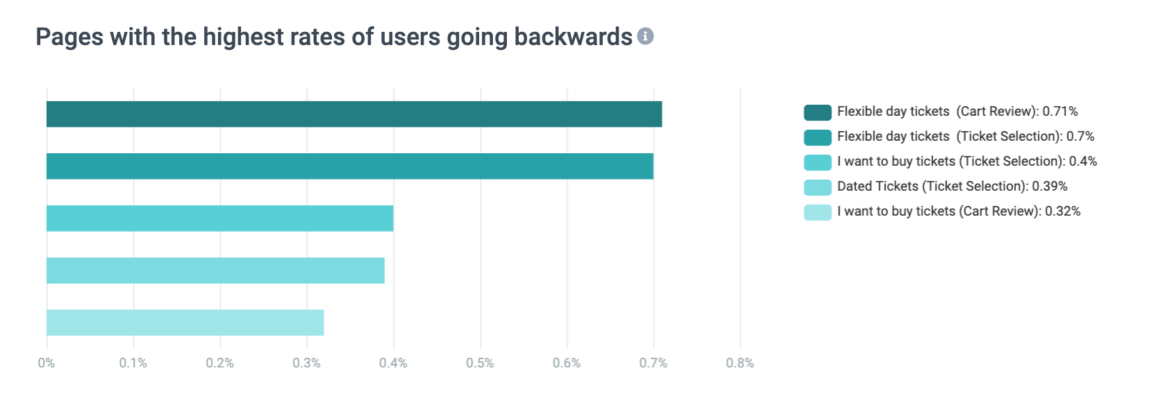
Pages with the highest backwards rate
The Backwards rate is the rate of Checkout visitors who go back to the previous step of the funnel. This means they enter a specific page, and then instead of proceeding or exiting, they choose to navigate a step back via the back button.
This can give you an indication of their sense of navigation within your funnel.
Questions & examples to discover (actionable) insights
Do many people exit after viewing their cart in the season pass flow?
Maybe it is too big of an investment for them, and they need more time. How about starting highlighting the value they get in return more.Do too many people go back and forth in the reservation flow?
Maybe something is unclear! Time to revisit your descriptions.Do too many people go back after reviewing ticket selections like you see in the example above?
Maybe your first page is not clear on what they can find within each category, so they need to click through all or most of them. Think about how you can make it clearer for them.
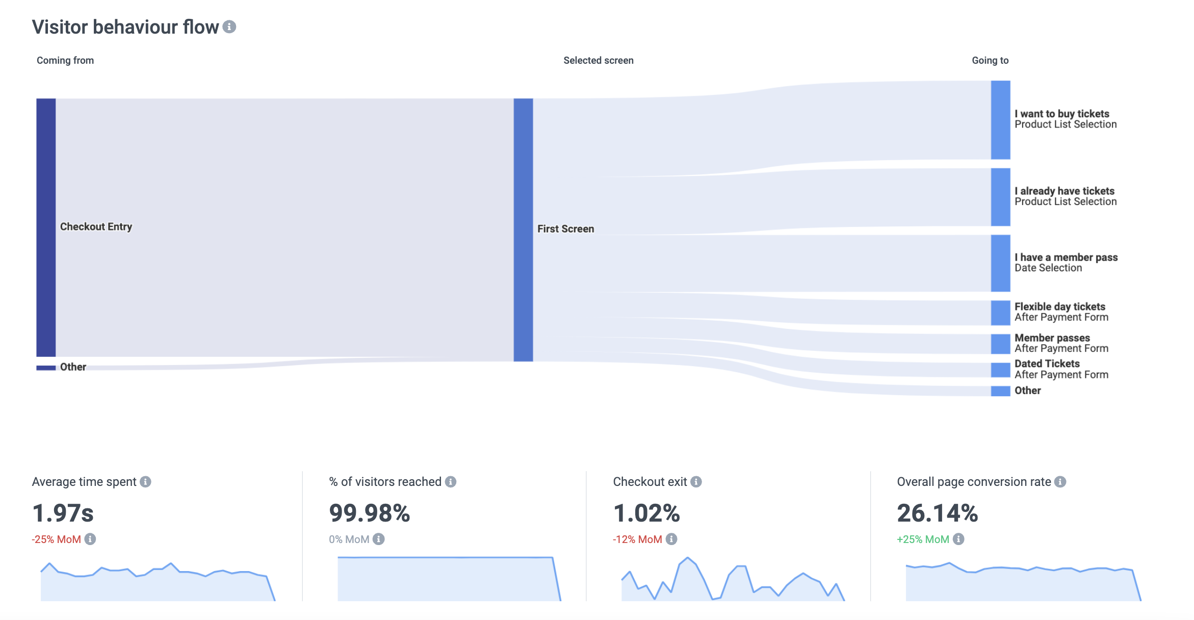
Visitor behaviour flow
Lastly, you have the visitor behavior flowchart.
By default, you again filter by the first page.
Let's talk about what we see here one-by-one.
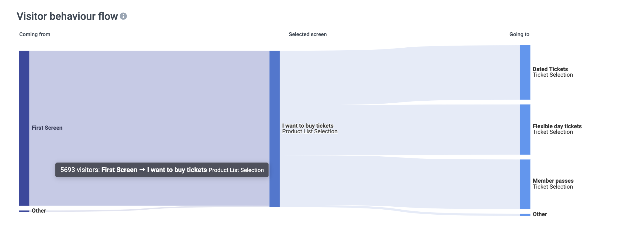
So we start with the flowchart itself.
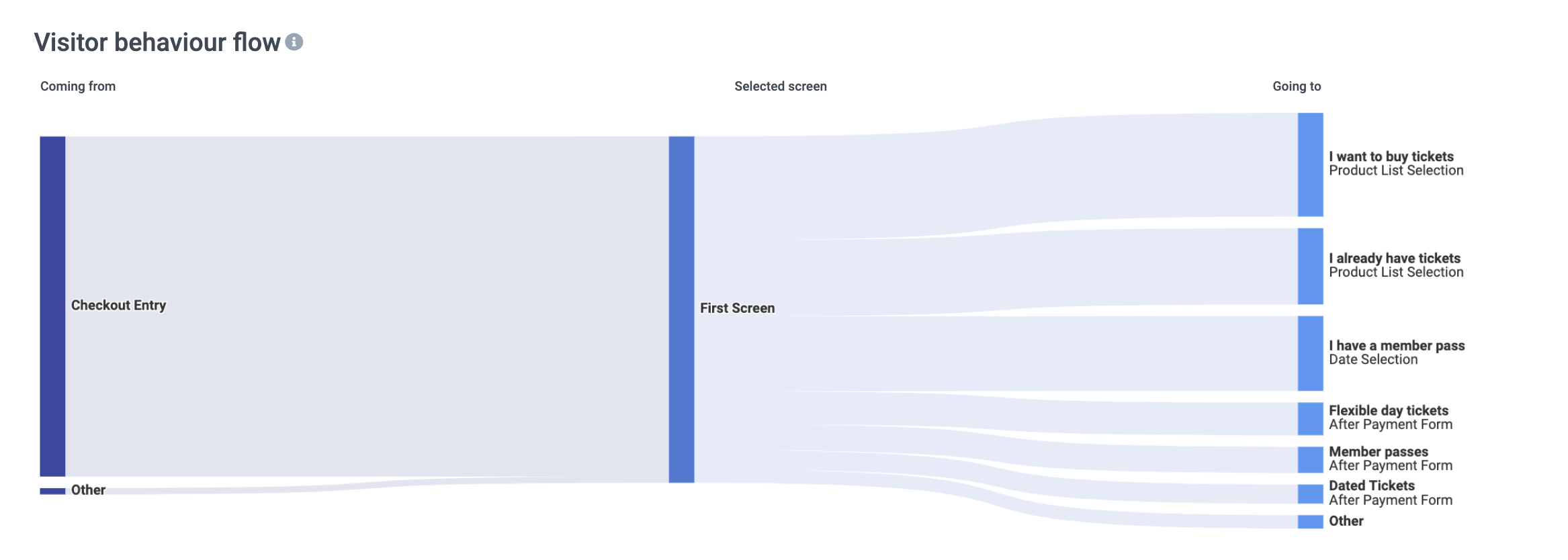
What Is crucial to understand is that the page used as the filter will always appear in the middle.
On the left, we can see where visitors came from and to the right, we can see where they went. Upon hover, we can find the actual amount of people who make up that flow or stream.
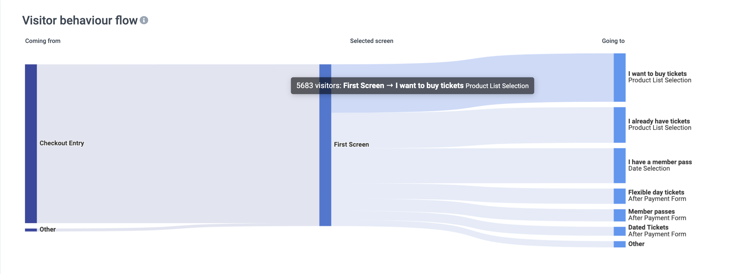
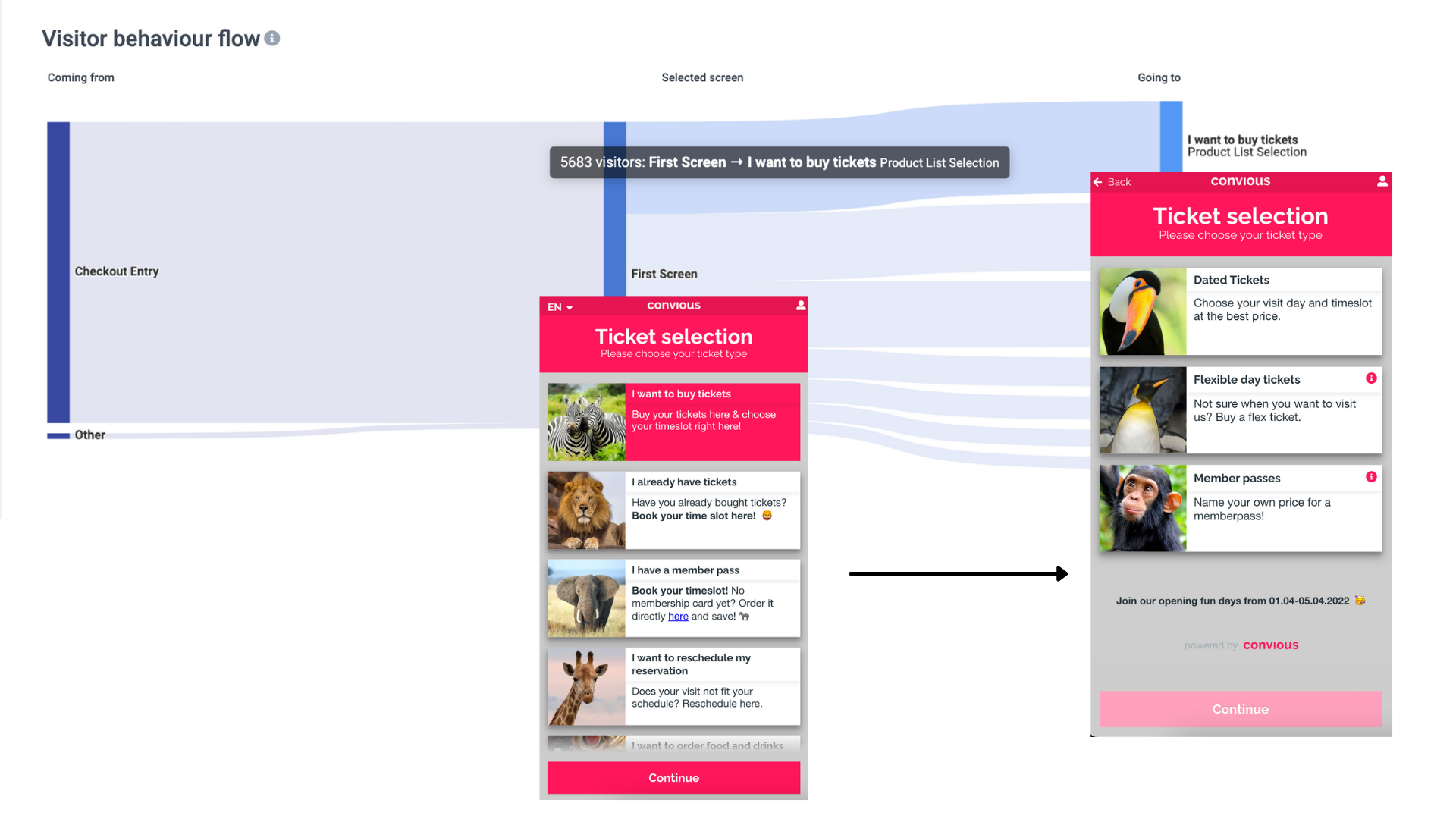
Above, we can see that 5683 visitors went from the first page to the 'I want to buy Tickets.' flow.
What does this look like in the Checkout? See below
Let's have a look at the numbers you see below the flow chart.
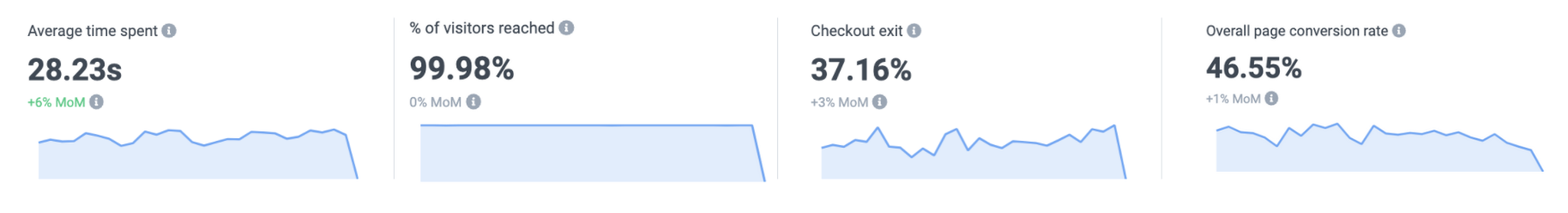
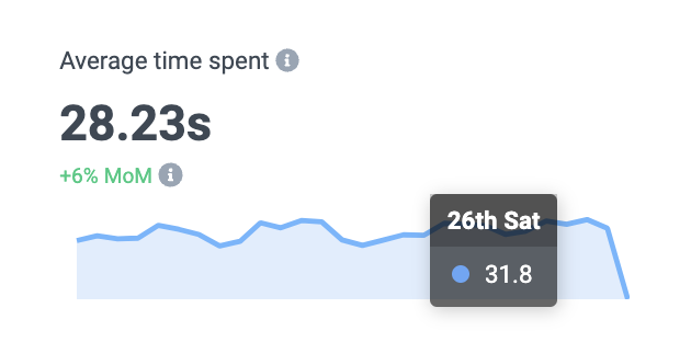
Average time spent: Here, you see the average time spent on the page you are filtering on.
In our example, you see the average time spent is 28.23 seconds. This is a slight increase (+6%) compared to the month before.
If you hover over the graphs below, you can even see detailed insight for your selected time frame.
% of visitors reached: This is the reach rate, so the rate of Checkout visitors who reached this page.
Checkout exit rate: The rate of visitors who exited (= leave) your Checkout after viewing/reaching this page.
Overall page conversion rate: The page conversion rate shows how many of those who visited this page ended up converting one way or another (new purchase or reservation).
Now that you have a first understanding of navigating around the chart let's select a filter and dive a bit deeper.
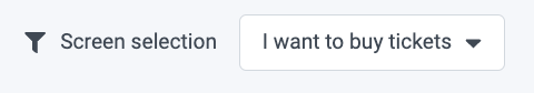
You can again filter by any flow or page. Let's stick with 'I want to buy tickets.'
Upon hover, you can see that it is a product list selection that received 5742 visits.
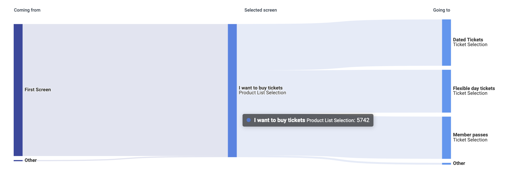
To the left of your selected page, you see where the visitors visiting the 'I want to buy tickets '/Product list selection came from. In this case, it is the first page, and a few also came from other sources - most likely deep links. Once again, upon hover, you can see the number of visitors and the behavioural flow (First screen → I want to buy tickets).
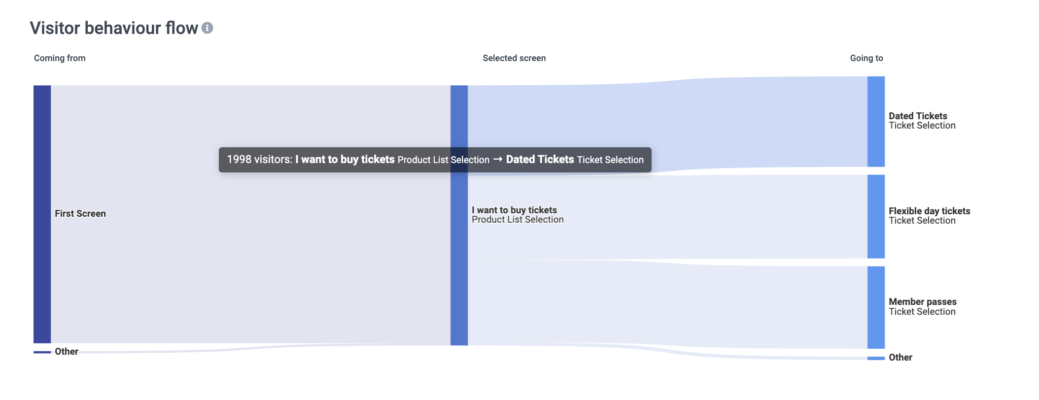
To the right of your selected page, you see where the visitors reaching the page navigated next.
In the above, we hovered over the flow to Dated Tickets, and we can see that 1998 visitors went from the I want to buy tickets page to the Dated Tickets.
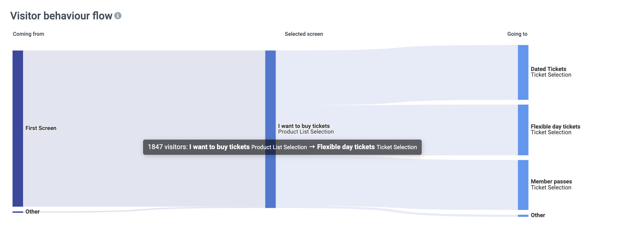
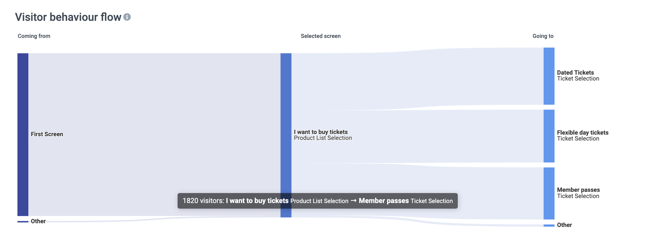
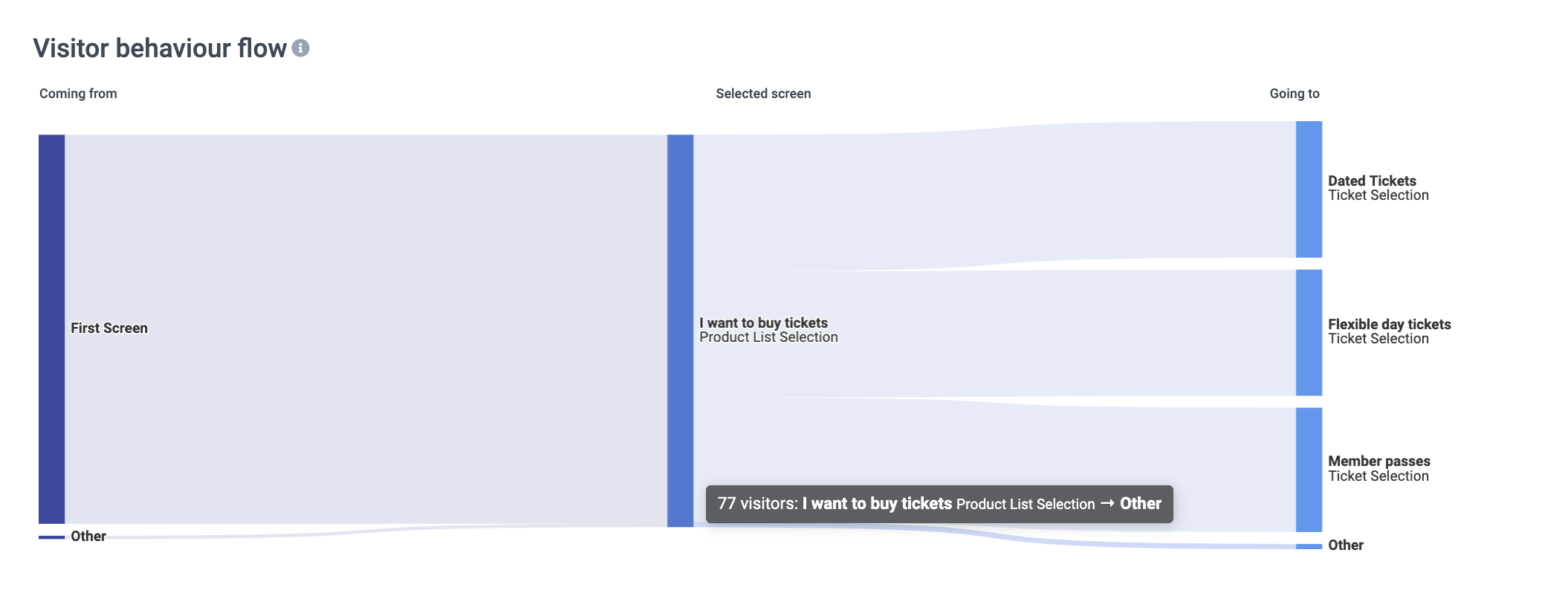
From a high-level view, we can tell the number of visitors going to either of the 3 product lists, but by hovering over all the other flows one by one, we can see the exact amount of visitors who navigated there.
Further, we can also decide to dive deeper into the users who went on to the Flexible day tickets, for example. Then all we got to do is change the filter.
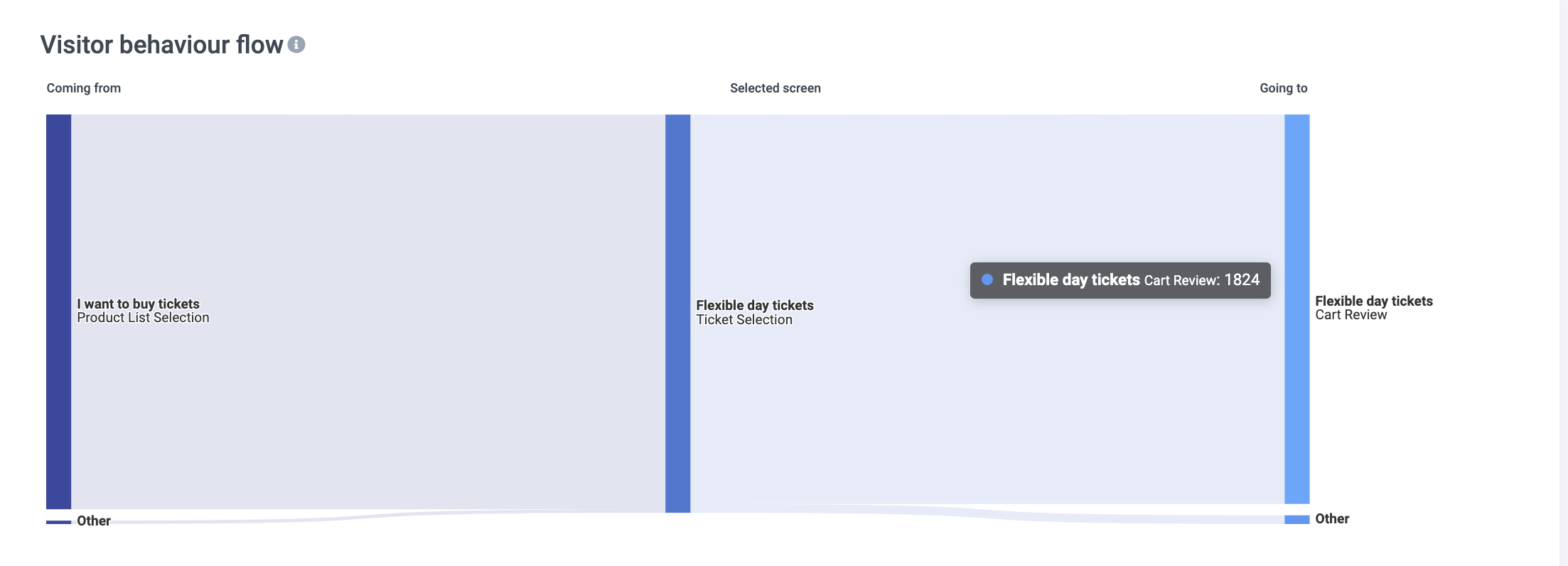
Now you see how many people reached the cart review page after selecting a flexible ticket.
Next, you could filter by the cart page to see how many actually went onto the payment and beyond and who went back or exited. This is how you can follow your visitors flow through the funnel and understand their behavior.
Questions & examples to discover (actionable) insights
Is there a lot of unexpected visit ratio between flows or ticket types? For example, much more traffic on a flow that does not lead to a relatable amount of revenue. Maybe it is time to review the offer or the way it is presented. Does it make sense to switch the order (priority)?
Are they spending a lot of time on certain pages?
A sign of unclarity - here as well, review the information you display.Does a certain page really lack behind or succeed in overall page conversion rate?
See what is different about them compared to the rest of your pages.
There are many more use-cases, and more examples will be added here! But please use the chance to click around and discover the behavioural flow of your visitors.
If there are any unanswered questions about your report or you need any assistance in interpreting what you see, feel free to reach out to our support team via support@convious.com
By taking targeted action, you can improve your buying experience and, therefore, also your revenue - while your funnel report helps you track and measure the impact of your efforts.