The Checkout performance report shows you how visitors move through your checkout, where they drop off, and which products and categories contribute most to your conversions. This article is for venue admins and marketing managers who want to diagnose checkout friction, prioritise optimisation work, and understand the revenue impact of each step in the funnel.
The report lives in the Marketing section of your Control Panel and replaces the previous checkout funnel report. It uses an improved checkout session model, so the numbers you see now reflect true checkout activity — sessions where a visitor genuinely entered the buying flow, rather than visitors browsing My Account or changing dates on a product page.
Where to find the report
Log in to your Convious Control Panel.
Open the Reports section in the left-hand menu and choose Marketing.
Select the Checkout performance tab. You will see it alongside Overview, Discount codes, Engage tools, and Emails.
Filtering your data
At the top of the report, two filters control everything below them:
Date range — Defaults to This month. Use this to compare specific weeks, months, or campaign windows.
Device type — Filter to desktop, mobile, or tablet to isolate device-specific behaviour.
Deeper sections of the report (exit-rate breakdowns and the product flow diagram) have their own additional filters — see the relevant sections below.
💡 Note: Most KPIs and charts are automatically compared against the same period last year, so you can spot trends without having to set up a custom comparison.
KPI overview
The top of the report shows six KPI cards summarising checkout health. Each card (where applicable) displays the percentage change versus the same period last year, so you can immediately see whether performance is improving or declining.
Total checkout sales — The total revenue generated from completed checkouts in the selected period.
Website conversion rate — The share of website visitors who complete a purchase. Use this as your top-line indicator of overall site effectiveness.
Checkout conversion rate — The share of visitors who entered the checkout and then completed a purchase. This isolates checkout performance from upstream traffic quality.
Avg. order value — Average revenue per completed order. A rising AOV often signals successful upsells, bundling, or pricing changes.
Upsell conversion rate — The share of checkouts that accepted at least one upsell offer.
Avg. time to convert — The average time visitors spend from entering checkout to completing payment. A sudden increase can indicate friction at a specific step.
💡 Note: Comparing Website conversion rate against Checkout conversion rate is one of the fastest diagnostics in the report. If your website conversion is low but your checkout conversion is healthy, the issue is upstream (traffic, landing pages, product discovery). If both are low, the friction is inside the checkout itself.
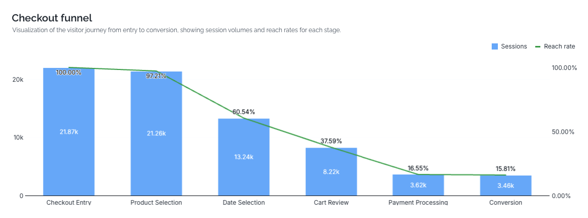
Checkout funnel chart
Below the KPIs, the funnel chart visualises how visitors progress through each stage of checkout. Bars show the number of sessions reaching each step, and an overlaid line shows the reach rate (the percentage of entries that made it that far).
The funnel steps are:
Checkout Entry — The visitor has opened the checkout.
Product Selection — They have chosen a product or ticket type.
Date Selection — They have picked a visit date (or time slot, depending on your flow).
Cart Review — They have reached the cart summary, ready to proceed to payment.
Payment Processing — They have initiated payment.
Conversion — The order is complete.
💡 Note: Step labels adjust automatically based on your checkout flow type. Partners using a calendar view and partners using a date-list view will see slightly different wording in the Date Selection step, but the funnel stages and what they measure are equivalent.
Use this chart to spot your biggest drop-offs at a glance. A steep cliff between two adjacent steps is usually where to focus first.
Checkout funnel performance table
Directly under the funnel chart, the performance table breaks each step down with four columns:
Sessions — How many sessions reached this step.
Backward rate % — The share of sessions that moved back to an earlier step from here. A high backward rate often means visitors are hesitating, comparing options, or finding the current step confusing.
Exit rate % — The share of sessions that abandoned checkout entirely at this step.
Avg. time — The average time visitors spend on this step before moving forward, back, or exiting.
Use the table to separate two very different problems:
A high exit rate at a step means visitors are giving up there. Investigate the step itself — pricing surprises, missing payment methods, or unclear messaging.
A high backward rate suggests visitors are unsure and looping back. The fix is often clearer information earlier in the flow rather than at the step itself.
⚠️ Important: A high Avg. time on a step isn't automatically bad — a calendar selection naturally takes longer than a one-click confirm. Always read time alongside exit and backward rates to judge whether the duration reflects friction or normal decision-making.
Where visitors drop off: product main categories with the highest exit rate
This chart highlights which product main categories lose the most visitors at each funnel step. It is grouped by funnel step (Product Selection, Date Selection, Cart Review, Payment Processing) so you can see which categories underperform at which stage.
Two controls let you adjust the view:
Exit rate / Backward rate toggle — Switch between visitors who abandoned at this step and visitors who moved back to an earlier step.
View by selector — Choose the level of grouping (for example, Product main category).
Example
Suppose Sunshine Safari Park sells day tickets, annual passes, and an add-on parking product. The chart shows that the Annual passes category has a 42% exit rate at Date Selection, while Day tickets sits at 18% at the same step. That's a strong signal that the date-selection experience for annual passes — perhaps an unclear validity window or a confusing start-date prompt — deserves a closer look.
Products most added to cart
This section ranks the products that reach the Cart Review stage most often during the selected period. Read it as a demand signal: it shows what visitors are seriously considering, not just what they viewed.
Use it to:
Identify your highest-intent products and feature them more prominently.
Spot products with high cart-add volume but low final conversion — these are strong candidates for checkout-level optimisation (clearer pricing, better date selection, additional payment options).
Conversion rate by upsell product
This chart shows how each upsell product performs at the product level. It complements the Upsell conversion rate KPI by telling you which upsells are doing the heavy lifting.
High conversion, low volume — The upsell works but isn't being shown often enough. Consider widening the audience or pairing it with more primary products.
Low conversion, high volume — The upsell is reaching plenty of visitors but isn't compelling. Review the offer, copy, or price point.
Low conversion, low volume — A candidate for retirement or a full redesign.
Product funnel flow
The Sankey diagram at the bottom of the report traces visitor journeys from product category through to final funnel outcome. It shows how visitors flow from Product main category → Product category → Product type → Specific product, and ultimately to either Conversion or exit.
Filters available on this section:
Product main category
Product category
Product type
Product name
Funnel step
Use the Sankey diagram to answer questions that aggregated charts can't, such as:
"Of everyone who added an annual pass to their cart, how many converted versus exited at payment?"
"Which specific product within the Experiences category contributes the most conversions?"
"Where do visitors who start with one product type end up — do they switch to a different product before converting?"
Example
At Adventure World, the Sankey shows that visitors starting in the Combo tickets category split roughly evenly between two specific product variants at the Product Selection step. One variant converts at 60%, the other at 22%. That's a clear prompt to investigate the lower-converting variant — pricing, naming, or the way it's presented — rather than treating combo tickets as a single block.
FAQ
Why are my session numbers lower than they were in the old checkout funnel report?
The new report uses an improved checkout session model that correctly excludes non-checkout activity — such as visitors browsing My Account or changing a date on a product page without entering checkout. Those events were previously counted as checkout sessions, which inflated the totals. The figures you see now reflect true checkout sessions only.
Why doesn't every KPI show a year-on-year comparison?
Year-on-year comparison is shown wherever it is meaningful and historical data is available. If a KPI is missing its comparison, it usually means there isn't a comparable period in the previous year (for example, a recently launched product or a partner that went live less than 12 months ago).
The exit rate on one of my steps looks very high — is something broken?
Not necessarily. Some friction is normal, especially at Payment Processing where external factors (declined cards, abandoned bank authentication) cause exits outside your control. Compare against the previous year and against other partners' typical ranges before assuming a technical issue. If you suspect a bug, contact the Convious support team with the date range and device type where you see the spike.