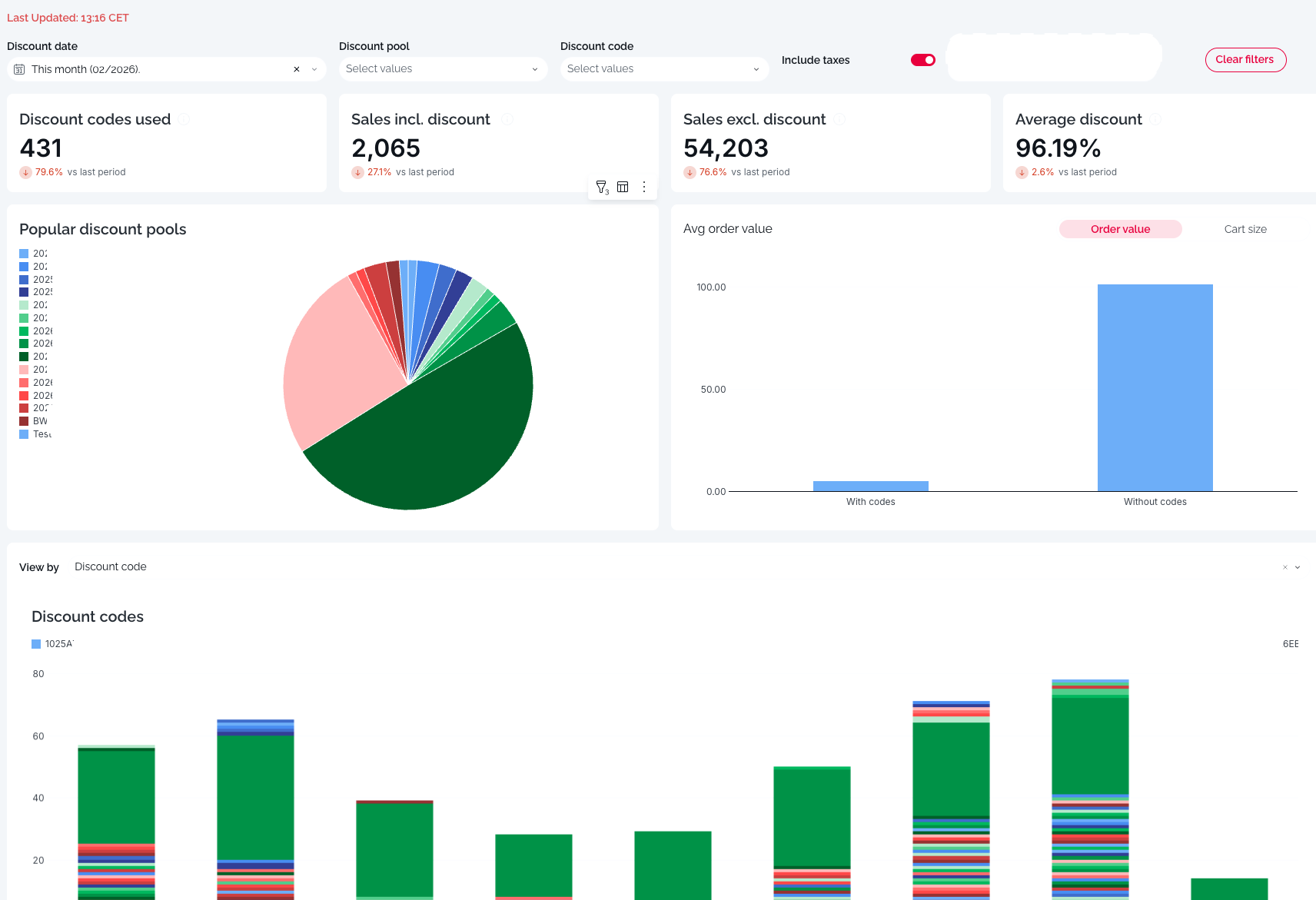
1. Filters & Controls
Located at the top of the dashboard, these controls allow you to refine the data displayed:
Filter Date: Select your desired time range (e.g., "Last 2 weeks," "Last Month"). The report compares current performance against the immediate previous period of the same length.
Discount Pool: Filter the data to show only specific groups of discounts (e.g., "Summer Campaign" or "Staff Discounts").
Discount Code: Drill down to view analytics for a single, specific code.
Include Taxes: A toggle switch.
On: Financial figures include tax.
Off: Financial figures are Net (pre-tax).
2. Key Performance Indicators (KPIs)
The top row presents four headline metrics. Each includes a trend indicator (percentage change) comparing the current selection to the previous period.

Discount Codes Used
Definition: The total count of discount codes or vouchers redeemed during the selected period.
Insight: Measures the volume of engagement. A spike here indicates a highly active campaign.
Sales Incl. Discount (after discount)
Definition: The actual revenue generated from orders where a code was used, after the discount was deducted.
Insight: This represents the cash flow gained from these promotional orders.
Sales Excl. Discount (before discount)
Definition: The theoretical revenue these orders would have generated if items were sold at full price.
Insight: By comparing this to "Sales Incl. Discount," you can see the total dollar value "given away" in promotions.
Average Discount
Definition: The average percentage saved by the customer per transaction.
Insight: Monitors the depth of your promotions. A higher percentage means deeper cuts into margins; a lower percentage suggests lighter incentives are being used.
3.Visual Insights & Charts
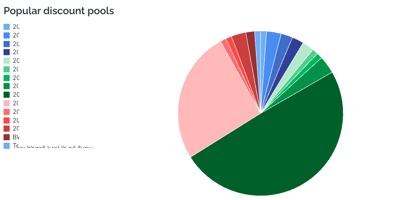
A. Popular Discount Pools (Pie Chart)
Description: A breakdown of usage by discount category (Pool).
Insight: Quickly identify which campaigns are driving the most volume. For example, you can see if "Blue Light" discounts are outperforming "Standard" vouchers.
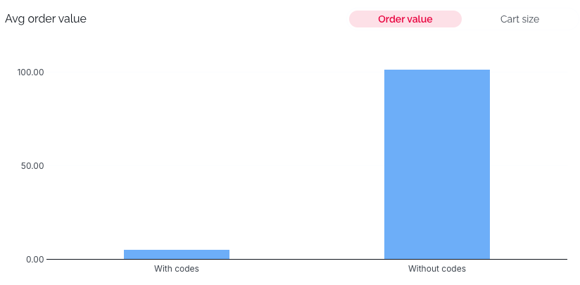
B. Avg Order Value: With vs. Without Codes (Bar Chart)
Description: Compares the average cart value of customers who use codes against those who don't.
Insight: Helps determine the ROI of discount users.
If the "With codes" bar is higher, your promotions are successfully encouraging larger basket sizes (upselling).
If the "With codes" bar is lower, discount users are spending less on average than your standard customers.
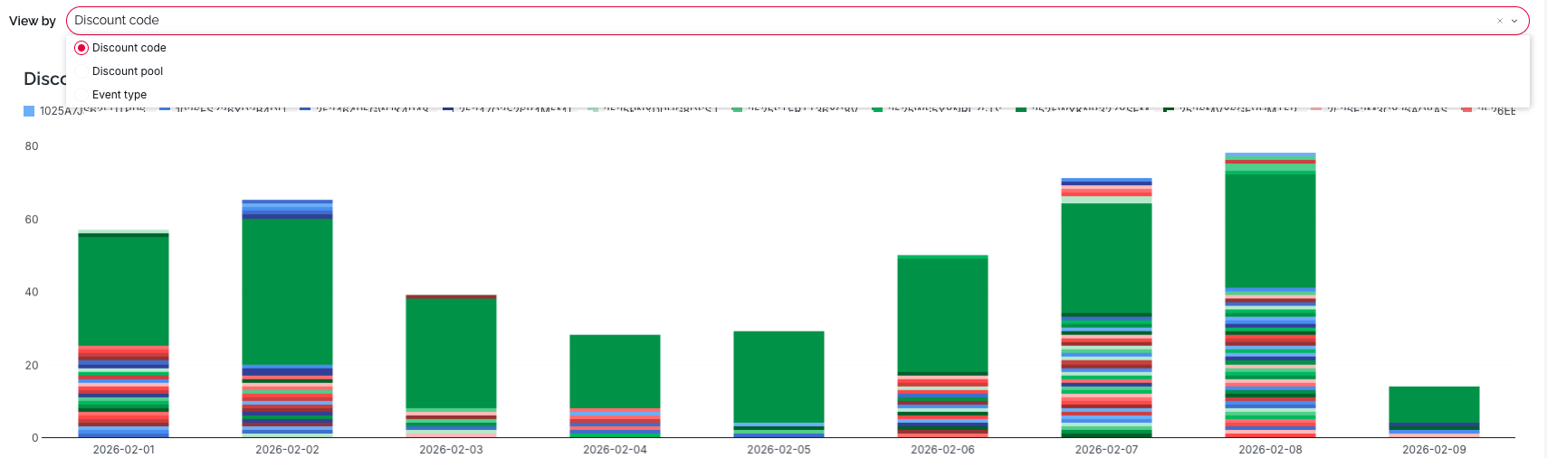
C. Discount Codes Daily Usage (Stacked Bar Chart)
Description: A timeline showing the daily volume of codes used, color-coded by the specific code name.
Insight: Useful for spotting trends over time, such as weekend spikes or the immediate impact of a marketing email blast on specific days.
View By: Discount Code, Discount Pool or Event Type
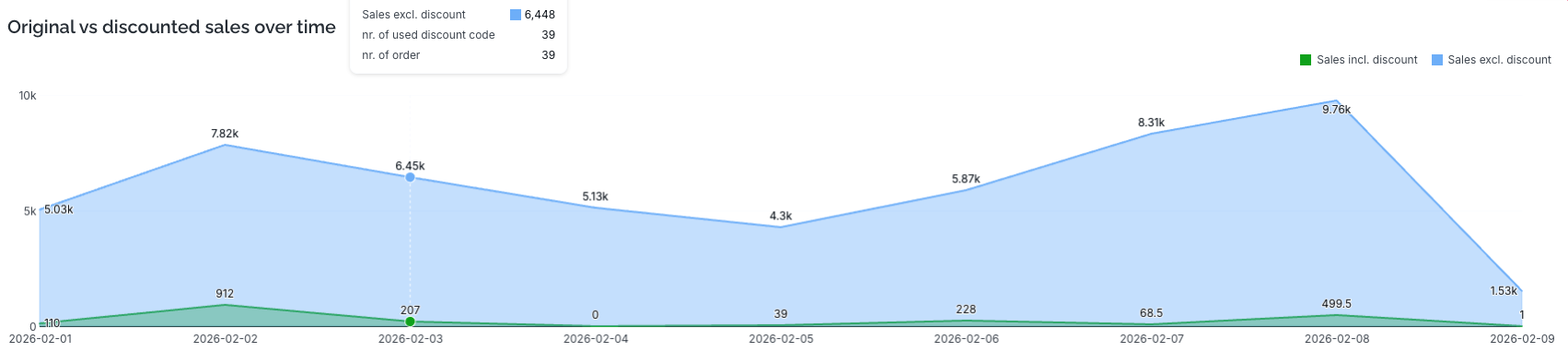
D. Original vs. Discounted Sales Over Time (Area Chart)
Description: A dual-layer area chart tracking revenue over the selected date range.
Blue Area (Sales excl. discount): The potential full value of sales.
Green Area (Sales incl. discount): The actual realised revenue.
Insight: Visualises the "Discount Gap." The space between the blue line and the green line represents the revenue forgone due to discounts. A widening gap indicates deeper discounting.
4. Detailed Data Table
Located at the bottom of the report, this table provides granular, line-by-line transaction data for auditing and reconciliation.
Key Columns:
Event Type: Distinguishes the action (e.g., "Sold Voucher" vs. "Used Percentage Discount").
Pool Name: The campaign category.
Discount Code: The specific alphanumeric code used.
Order ID: The unique reference for the transaction.
Root Discount code: The original discount code which the balance was delivered.
Discount Value Percentage: The percentage off applied (if applicable).
Sales Excl. / Incl. Discount: The specific financial breakdown for that single line item.